Given the complexity of the data and how it is (and isn’t) publicly released, we did a yes/no analysis of whether or not there was drought in a given county and year, and whether or not there were one or more claims in a given county and year. The basic comparison is a two-by-two table (also known in different disciplines as a confusion matrix or a contingency table) for each county-year-crop combination, i.e., wheat in McPherson County, Kansas, 2000-2023:
| Drought claims during drought |
No drought claims during drought |
| Drought claims during non-drought |
No drought claims during non-drought |
Odds Ratio
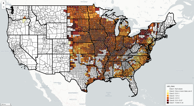 This map shows the odds that there will be a claim for soy during drought, when drought is defined as D0 or worse.
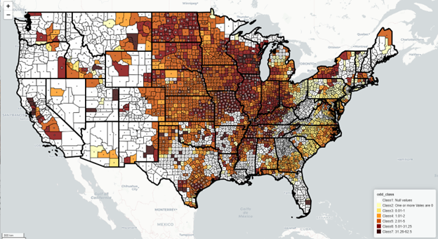
We used the table above to calculate an odds ratio for each county and crop across the contiguous U.S., showing the odds that at least one drought-related claim would occur during drought. Higher odds ratios are darker colors on the maps. Odds ratio maps by crop and drought level are interactive. Hovering over a county provides more information.
For additional insight, for each of the calculations based on the two-by-two table (odds ratio, reverse odds ratio and Yule’s coefficient), we defined drought by each category of the USDM, i.e., D0 or worse, D1 or worse, and so on through D4. We noted that the likelihood of a drought claim during D4 drought was actually lower, presumably because producers had already filed claims by the time it was that serious.
As an aid to comparison, for quick pattern scanning, we assembled 10-map panels showing all five drought cutoffs for the odds ratio and reverse odds ratio maps.
Test of statistical significance
We computed a chi-square statistic to see whether the odds ratio results could be due to chance or whether drought has an effect. Larger circles mean greater statistical significance (lower p values), i.e., it’s probably due to drought rather than chance. Counties with dark colors (higher odds ratios) but with little or no statistical significance are often counties with fewer producers buying insurance.
Reverse odds ratio
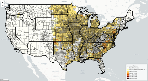 This map shows the reverse odds ratio for soy, the odds that there will be a claim when there is no drought, with drought defined as D0 or worse. The widespread light color indicates odds less than one in most areas, meaning drought related claims are less likely to occur when there is no drought.
We could also see that many drought-related claims occurred when there was no drought, so we computed a “reverse odds ratio,” the odds of having a drought-related claim during non-drought periods. We note that there are many possible explanations for drought-related claims during non-drought, including how drought is defined and local variation in rainfall.
Yule’s colligation
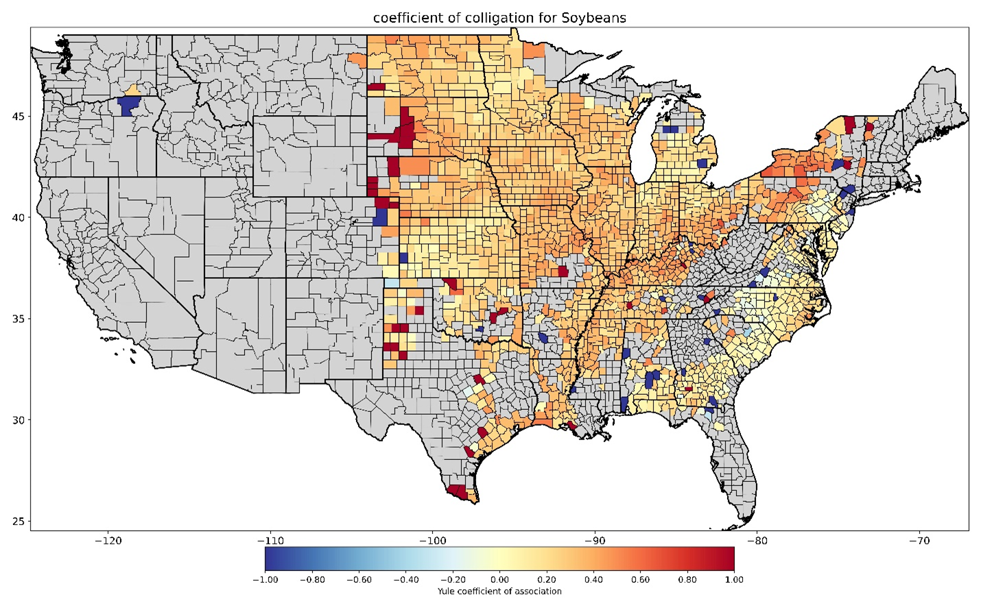 This map shows Yule’s coefficient of colligation for soybeans, which uses same the two-by-two matrix but expresses the results on a scale from -1 (blue, unlikely to have drought claims during drought) to 1 (red, likely to have drought claims during drought), rather than as odds.
As an alternative to looking at the odds ratio and reverse odds ratio maps, we computed Yule’s coefficient of colligation, which uses the same data but expresses the results on a scale from -1 to 1.
As an aid to comparison, for quick pattern scanning, we assembled Yule’s colligation maps for all five drought levels. For a few major crops, this includes separate columns for calendar year and growing season correlations.
Growing season
 Map shows odds of having a drought-related claim for corn during D1 drought or worse during the months of the growing season.
Recognizing that drought may have a greater effect during certain months of the year, we did a separate analysis just based on the months of the growing season for crops where the growing season could be defined.
Irrigation
The RMA Cause of Loss data as publicly released does not include information about irrigation practices. We can’t tell which drought-related claims were for irrigated or non-irrigated crops. RMA separately releases information about irrigation practices for different crops, counties and years. We used that data to provide a more general look at how important irrigation is in different counties. For example, in Arizona, where the odds of a drought-related claim for wheat are actually lower than one, meaning drought-related claims are less likely during drought, it appears that all of the insured wheat is irrigated. In contrast, irrigated wheat is a much smaller portion in Kansas.
Considerations
It is worth mentioning that the odds of any claim, drought-related or otherwise, are greater in places where farmers buy more insurance. And that in turn is based on what crops are grown where.
Results are more likely to be extreme but less likely to be statistically significant when there are fewer observations.
Data and methods for odds ratio, Chi-square test and Yule’s colligation
Additional detail is available on the data and methods we used for this part of the analysis.