NDMC used data from CropScape and RMA’s annual Summary of Business data to do a county-by-county comparison of how many acres were planted with a particular crop and how many acres of that crop were insured, each year from 2012 to 2023. CropScape’s “Cropland Data Layer” is based on remote sensing (satellites) and “allows users to easily conduct area and statistical analysis of planted U.S. commodities,” as described by the USDA’s National Agricultural Statistics Service. Remote sensing may provide a more comprehensive look at where commodities are grown than alternatives such as annual survey data or the every-five-years Census of Agriculture. Using a five-year maximum helped account for the margin of error in the CropScape data. However, that margin of error is substantial, and varies by crop and state. CropScape is more than 70% accurate for only a handful of crops. These maps may interesting for identifying patterns over space and time, but should not be the sole basis for any decision. To learn more about CropScape and to find accuracy ratings by crop and year, please visit: https://www.nass.usda.gov/Research_and_Science/Cropland/sarsfaqs2.php
NDMC used three different methods to compare acres planted to acres insured, each highlighting a different aspect. Maps are available from 2012 to 2023 for each of the major crops with available data in both CropScape’s Cropland Data Layer and RMA’s annual Summary of Business data.
Looking at the maps for a single crop over time appears to show annual fluctuations – not necessarily a directional trend – in producers’ decisions to insure crops. Better understanding the incentives and considerations that went into these decisions could provide additional insight into how producers perceive and use crop insurance programs.
Subtraction: Acres planted–acres insured
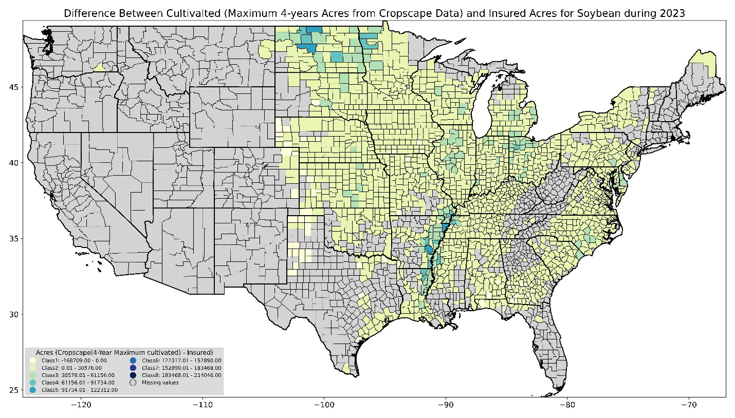 This map shows the simple difference between the number of acres planted in soybeans in 2023.
Percentage: Acres insured as a percentage of acres planted
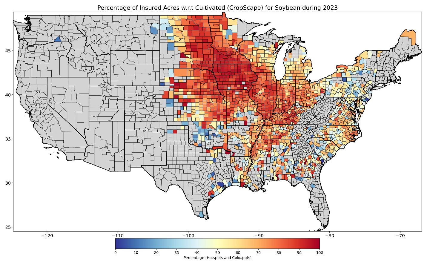 This map shows acres insured as a percentage of acres planted, for soybeans in 2023.
Outliers, counties with several times more acres insured than planted, are omitted from this data. They are probably due to irregularities in the CropScape data.
Normalized Insured Index: Insured-planted/insured+planted
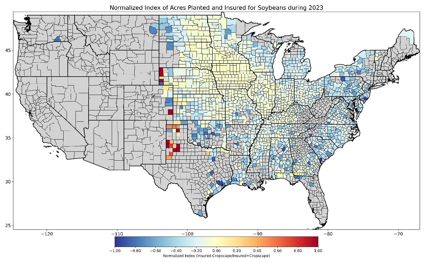 This map shows the Normalized Insured Index for soy for 2023. Counties in red that do not appear on the percentage maps are counties where the number of acres insured greatly exceeded the number of acres planted, likely due to limitations of the CropScape data.
Using a Normalized Insured Index (NII) to compare acres planted with acres insured appears to capture more nuance than a simple difference or a percentage, but seeing the earlier maps may help build understanding to interpret the more complex NII maps.
Data and methods for comparison of acres planted to acres insured
Additional detail is available on the data and methods we used for this part of the analysis.